alt tweet Facebook vimeo pinning instagram
  • Subscribe to the Alt Newsletter! *

Categories
Search
Buzz From Alt
Meet Our Speakers from SLC 2013
Sorry, Flickr is not responding.

Entries in Design (18)

Monday
Jul082013

A Roadmap For HTML And CSS

By: Joy Laforme.  Photo by: They Draw & Travel. 

The word “code” has always been somewhat of a four-letter word to many people. It’s synonymous with mathematical equations and difficult concepts that easily overwhelm us. But in reality, the relationship between HTML and CSS provide those with an online presence with a powerful tool to increase our creative abilities and online reach.

Click to read more ...

Thursday
May302013

A Style Guide for Bloggers Sponsored by MailChimp

By: Kate Kiefer Lee of MailChimp Artwork by: Belinda Marshall

As your blog grows, you'll need a style guide to make sure your content is consistent and everyone you're working with is on the same page. Consistency gives your blog credibility, especially as your audience grows and you start hiring contributors. Style guides don't have to be elaborate, and websites of any size can benefit from them. Even if you're the only one writing, it helps to have a simple list of guidelines to refer to.

Don't think of your style guide as a set of rules and regulations—it's just a handy tool that will make your content more engaging and professional. Here are some tips for creating style standards that work for you.

Click to read more ...

Friday
May242013

Pro Tips: The Best Fonts for Web Design

By: Jenny Batt and Laurie Smithwick.

Here on the blog we've asked the pros to share their expertise and give the Alt community some tips and tricks. One of our favorite pros is the amazing Laurie Smithwick, of Leap Design, our graphic design guru. At Alt Channel we have a lot of amazing teachers, and I couldn't think of anyone better to start the series off with a bang. If you have ever had the pleasure of taking one of her classes, you already know she has gobs of information to share about design. We asked if she would share her 10 favorite fonts for the web, and she gave us 12. Even better? Most of these fonts are FREE! Laurie, that's why we love you.

Here are Laurie's best picks for web fonts and her notes below each:


1. Proxima Nova

I use this for almost everything because it looks so much like Gotham (which isn't available as a webfont) and I use Gotham in so many of my designs. In my opinion, this font is worth the price of admission to Typekit.

2. League Gothic

I love the retro feel of this non-decorative sans serif font. I use Trade Gothic in my designs a lot, and this font is a great web-safe version of that. I love it in all caps.

3. Fjord

I'm a huge fan of clean serif fonts. This one is great for body copy. But I also love using fonts that are typically text fonts for headlines. Love the way this one looks at large sizes with the curves in its serifs.

4. Arvo

This is a really well-designed slab serif font. I love how it manages to be both strong and graceful. And I like that the serifs aren't too large. That gives this font a subtlety that most slab serifs don't have.

5. Bebas Neue

Just a good, clean, strong, sans serif, all caps headline font. I prefer Bebas Neue to the original Bebas. It's built better.

6. Abel (Google Fonts)

Another nice sans serif. I love the way this font's curves are slightly squared off. And the tall x-height and points at the ends of some of the letters give this font such a modern feel. One of my favorites -- I love having the opportunity to use it.

7. Pacifico

Love this fun script font. Very cartoony, but if used correctly, it can be very clean and bold. Not something many script fonts can achieve.

8. Raleway

This font just keeps getting better and better. Originally it only had the light weight which meant it wasn't versatile enough for most jobs. But The League of Moveable Type has added many weights to the family and now it's a fantastic clean sans serif font. I'm not a huge fan of the lowercase "w" but other than that, I love it.

9. Droid Serif

 I think Droid Sans is a little overused. But I really love Droid Serif. It's a graceful, modern font with curvy slab serifs (like Clarendon). But it's a more vertical font which makes it feel very current.

10. Dancing Script

Another nice script font that isn't too flowery or showy or decorative. Clean and simple, with graceful thicks and thins.

11. Franchise

A great retro font with a strong, letterpress, wood-type feel. It's a beautifully designed font that is well-built so it looks great on the web and also in print. I've been using this one a lot lately in my "Step Away from the Screen" designs. Looking forward to being able to use it on a website, too.

12. Neue Helvetica 35 Thin

I've always been a Helvetica lover (either you are or you aren't) and Fonts.com has made the great evolution of Helvetica Neue available for web use. 35 Thin is such a beautiful font -- I just used it on a website and I'm so happy with how it turned out.

** Bonus: Want to be able to identify fonts you see on websites? Check out WhatFont -
I use the Chrome Plugin (they also have a Safari Plugin and a Bookmarklet) and it's so super easy. You see a font on a website, you like it. you click the little WhatFont icon and it tells you what font you're looking at. Brilliant.

There you have it, Laurie Smithwick's 12 favorite fonts for web design. Thanks Laurie! Headed to Alt SF or Alt NYC? Be sure to check out Laurie's class, How to Win at Business Cards, in June!

Monday
May062013

How to Keep Readers on Your Site: Part 2

By: Melanie Burk. Artwork by: Claire Desjardins

We often focus only on creating original content. Over and over again we hear "content is king" and yes, this is true. But if you don't know how to display your content, how can you get viewers to actually stop and read it? As we discussed in our last post in this series, viewers skim, they don't read.

How can you help them to actually stop and read that amazing content you spent hours creating and writing? Here are a few tips to success: 

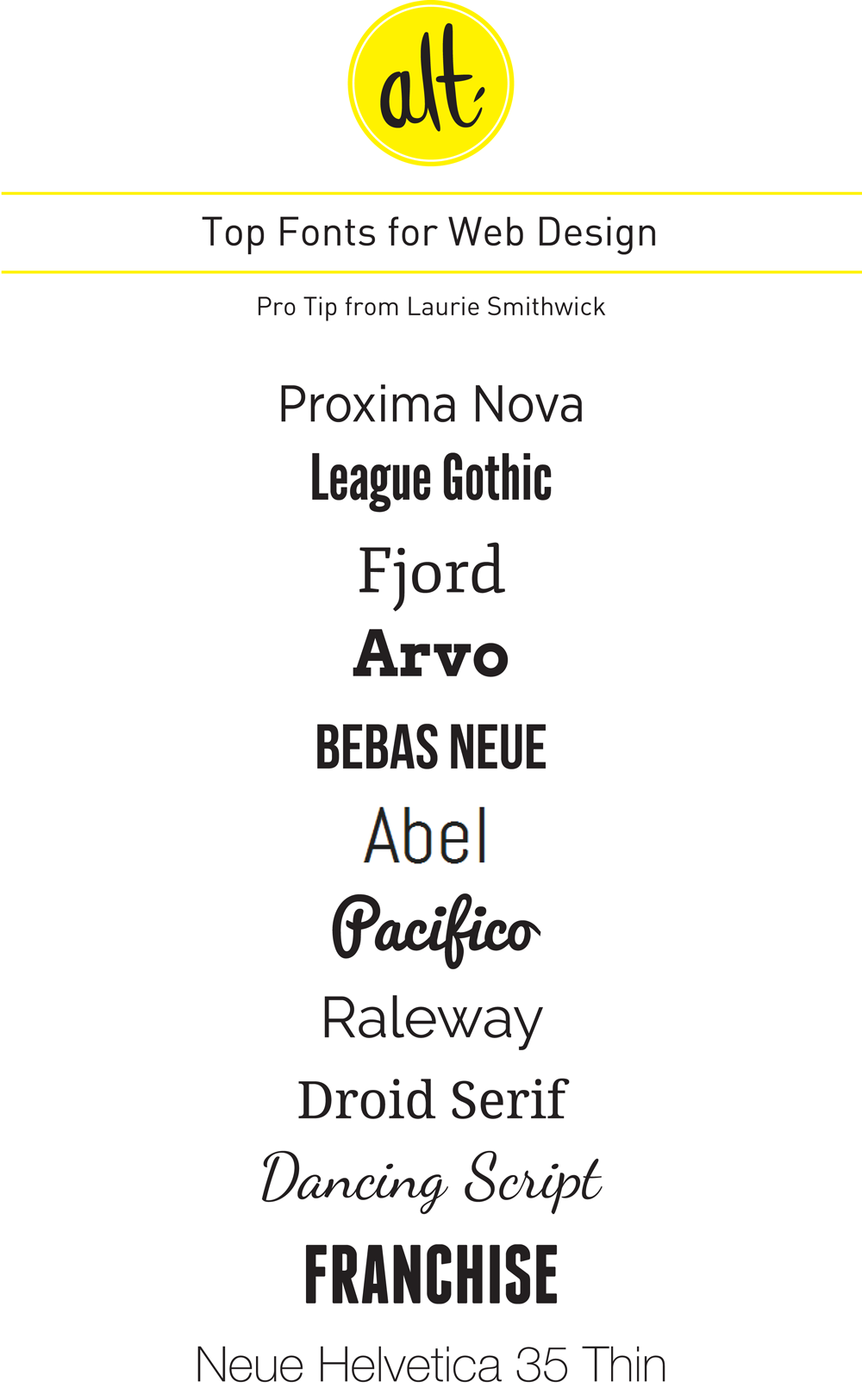
1. Keep your text a good, readable size

This is one of the most important usability tips. We were trained in school that 12 pts was the right size on Word, but remember this applies to printing out essays, not on your blog!

In fact, the recommended size by online usability experts is 16 px! That is much, much bigger than 12 px! (I personally recommend 15-16 px for my clients) This can be the simplest change you can make to your site, that can help people read your blog posts–just changing the pixel size and making it bigger can make it easy to read, and keep viewers on your site. 

2. Keep the background clean, and evaluate what you add to your site so it doesn't distract from the posts

Often as bloggers and creatives, we really want to pack in the art and beauty wherever we can. We want to add patterns to the background, images in each side of the column, and fill in every open space with instagram images, our followers, and everything you can think of. Unfortunately, this can really detract and pull away from your content. Remember, more on your site can actually hurt reader interaction–it easily confuses and distracts your viewers. 

Remember this– designing your site or blog is not the same as designing a room. You cannot "accessorize" every part of your site. Really evaluate every element you add in- is it worthwhile? Would I want my viewers to click on this? Is it too distracting from my content? Is there some way I could consolidate this information and make it easier to understand? Stripping down your information in side columns can really help people read your content, and can help them focus on what you want them too–your key blog posts, and those column widgets that you do feel are important. So keep it as simple as you can, and design well the things you need to add!

3. Break up lots of text with images or quotes

Writing online is different than writing a book. Try to keep your paragraphs to 2-3 sentences in length to help eyes focus on your text. When people read online, they need that white space to focus and continue reading, without getting impatient or bored. Also, break up every few paragraphs with a quote, or a text, to help keep viewers engaged and interested.

These few tips, when followed, will really help viewers focus on your good content. It can be strange getting used to keeping your paragraphs short, or writing in such a big pixel size, but once you get use to it and embrace it, watch how your viewers will start to really read and interact with your blog posts!


Wednesday
Sep122012

Design Tips for Facebook Timeline Pages

By guest contributor Ciera Holzenthal.

I manage a few different fan pages on Facebook so when I saw that the timeline for pages was launching, I decided to go ahead and get the switch over with! I definitely learned a few things during this process and would love to share some tips!

Customize App Icons

Unlike the old page design, the new page lets you upload your own custom app image, which is really great! Since these tabs are now smack at the top of you page, they can really look a mess if you don’t customize them… so customize your app icons!

Before Custom App Images:

After Custom App Images:

Example: After I arranged my apps in my preferred order, I designed three custom images that matched the look of my profile photo. I wanted these icons to be bold and simple.

Directions: For each app that you would like to customize, design one image (111 x 74 pixels), click the pencil icon and “edit settings.” Here you can update the “Custom Tab Image” and the “Custom Tab Name.” Make those changes and don’t forget to hit “okay” to save!

Click to read more ...