
Pro Tips: The Best Fonts for Web Design
By: Jenny Batt and Laurie Smithwick.
Here on the blog we've asked the pros to share their expertise and give the Alt community some tips and tricks. One of our favorite pros is the amazing Laurie Smithwick, of Leap Design, our graphic design guru. At Alt Channel we have a lot of amazing teachers, and I couldn't think of anyone better to start the series off with a bang. If you have ever had the pleasure of taking one of her classes, you already know she has gobs of information to share about design. We asked if she would share her 10 favorite fonts for the web, and she gave us 12. Even better? Most of these fonts are FREE! Laurie, that's why we love you.
Here are Laurie's best picks for web fonts and her notes below each:
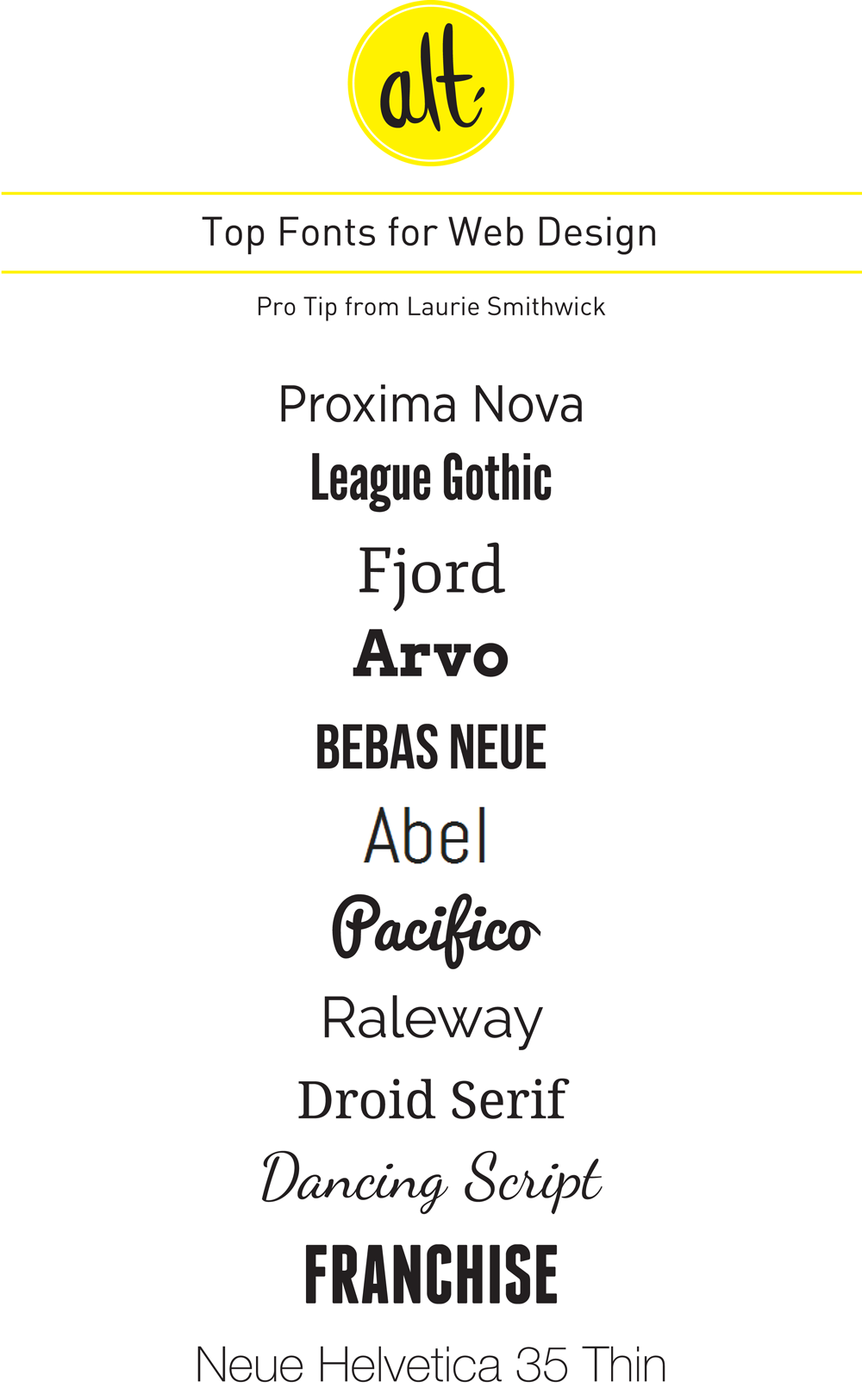
1. Proxima Nova
I use this for almost everything because it looks so much like Gotham (which isn't available as a webfont) and I use Gotham in so many of my designs. In my opinion, this font is worth the price of admission to Typekit.
2. League Gothic
I love the retro feel of this non-decorative sans serif font. I use Trade Gothic in my designs a lot, and this font is a great web-safe version of that. I love it in all caps.
3. Fjord
I'm a huge fan of clean serif fonts. This one is great for body copy. But I also love using fonts that are typically text fonts for headlines. Love the way this one looks at large sizes with the curves in its serifs.
4. Arvo
This is a really well-designed slab serif font. I love how it manages to be both strong and graceful. And I like that the serifs aren't too large. That gives this font a subtlety that most slab serifs don't have.
5. Bebas Neue
Just a good, clean, strong, sans serif, all caps headline font. I prefer Bebas Neue to the original Bebas. It's built better.
6. Abel (Google Fonts)
Another nice sans serif. I love the way this font's curves are slightly squared off. And the tall x-height and points at the ends of some of the letters give this font such a modern feel. One of my favorites -- I love having the opportunity to use it.
7. Pacifico
Love this fun script font. Very cartoony, but if used correctly, it can be very clean and bold. Not something many script fonts can achieve.
8. Raleway
This font just keeps getting better and better. Originally it only had the light weight which meant it wasn't versatile enough for most jobs. But The League of Moveable Type has added many weights to the family and now it's a fantastic clean sans serif font. I'm not a huge fan of the lowercase "w" but other than that, I love it.
9. Droid Serif
I think Droid Sans is a little overused. But I really love Droid Serif. It's a graceful, modern font with curvy slab serifs (like Clarendon). But it's a more vertical font which makes it feel very current.
10. Dancing Script
Another nice script font that isn't too flowery or showy or decorative. Clean and simple, with graceful thicks and thins.
11. Franchise
A great retro font with a strong, letterpress, wood-type feel. It's a beautifully designed font that is well-built so it looks great on the web and also in print. I've been using this one a lot lately in my "Step Away from the Screen" designs. Looking forward to being able to use it on a website, too.
12. Neue Helvetica 35 Thin
I've always been a Helvetica lover (either you are or you aren't) and Fonts.com has made the great evolution of Helvetica Neue available for web use. 35 Thin is such a beautiful font -- I just used it on a website and I'm so happy with how it turned out.
** Bonus: Want to be able to identify fonts you see on websites? Check out WhatFont -
I use the Chrome Plugin (they also have a Safari Plugin and a Bookmarklet) and it's so super easy. You see a font on a website, you like it. you click the little WhatFont icon and it tells you what font you're looking at. Brilliant.
There you have it, Laurie Smithwick's 12 favorite fonts for web design. Thanks Laurie! Headed to Alt SF or Alt NYC? Be sure to check out Laurie's class, How to Win at Business Cards, in June!
 5 Comments
Reader Comments (5)
Hey! I use Abel on my blog - yayy, it's one of your favourite ;)
Raleway is one of my favorites! :)
@Giulia - Abel looks great on your blog! Nice work!
@Amaris - I love Raleway. I was so excited when The League of Moveable Type expanded the family.
saved! thank you so much for this. I think my sites will look better with one of these on them.
Nice